28 hours to fix the contact flow
Users were leaving without talking to a single seller. The contact flow was broken at one precise point and that's the only thing that needed fixing.
A UX sprint with no time for the ideal process. I identified the exact breaking point and fixed it with surgical precision. Nothing more, nothing less.
Product Snapshot
This case study documents a 28-hour design sprint that rebuilt a car marketplace around trust, not just navigation. The hardest problem wasn't organizing the catalog, it was making a stranger feel safe enough to contact a seller.
Context
Car marketplace, C2C/B2C
Buyers browsing listings with no clear path to contacting a seller.
Problem
Missing trust, not missing information
The catalog had content but no hierarchy, and no reason to trust a seller.
Solution
Trust-first redesign
Rebuilt the browsing and contact flow around social proof and process transparency.
Role
Senior Product Designer
Research, personas, wireframes, and final UX-UI, end-to-end.
Team
Solo design sprint
Full ownership from research through final UI, no handoff mid-process.
Outcome
Full UX+UI delivered in 28 hours
Across desktop, tablet, and mobile viewports.
Scope
End-to-end sprint
Research, personas, wireframes, wireflows, and high-fidelity UI.
Context
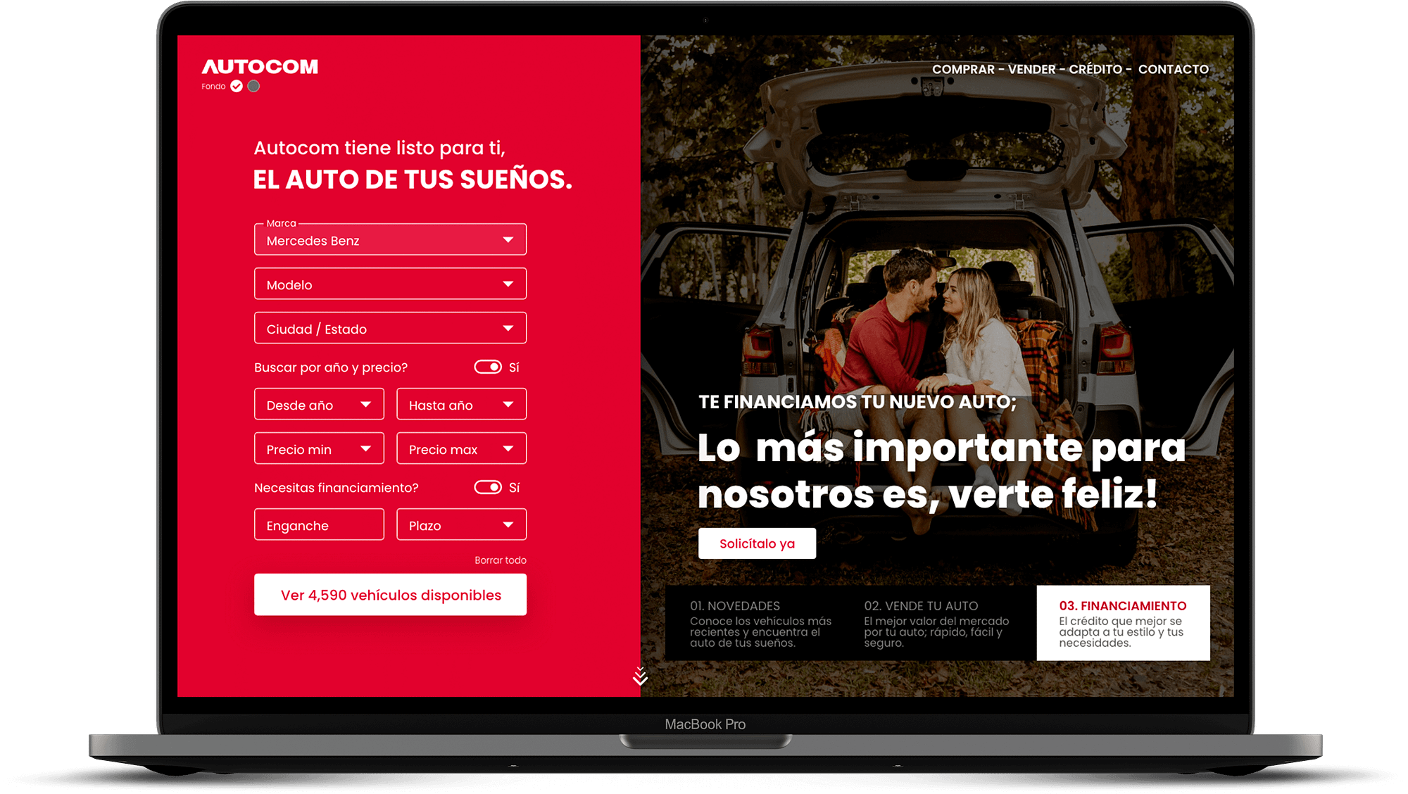
Autocom is an automotive marketplace where customers research vehicles online before completing purchases at physical dealerships. The platform needed to support the full top-of-funnel journey, discovery, research, trust-building, and purchase intent.
Problem
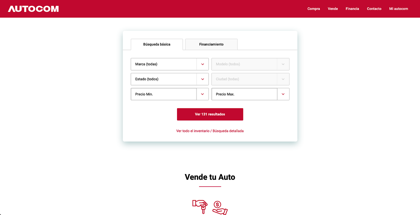
The existing site had no working visual hierarchy between titles, images, and calls-to-action. Users couldn't navigate the catalog effectively. The absence of trust signals left potential buyers hesitant to engage, and the core flow failed to guide anyone through a purchase decision.

“It's not only about sales — it's about making me feel more comfortable about my decision to buy.”
Research
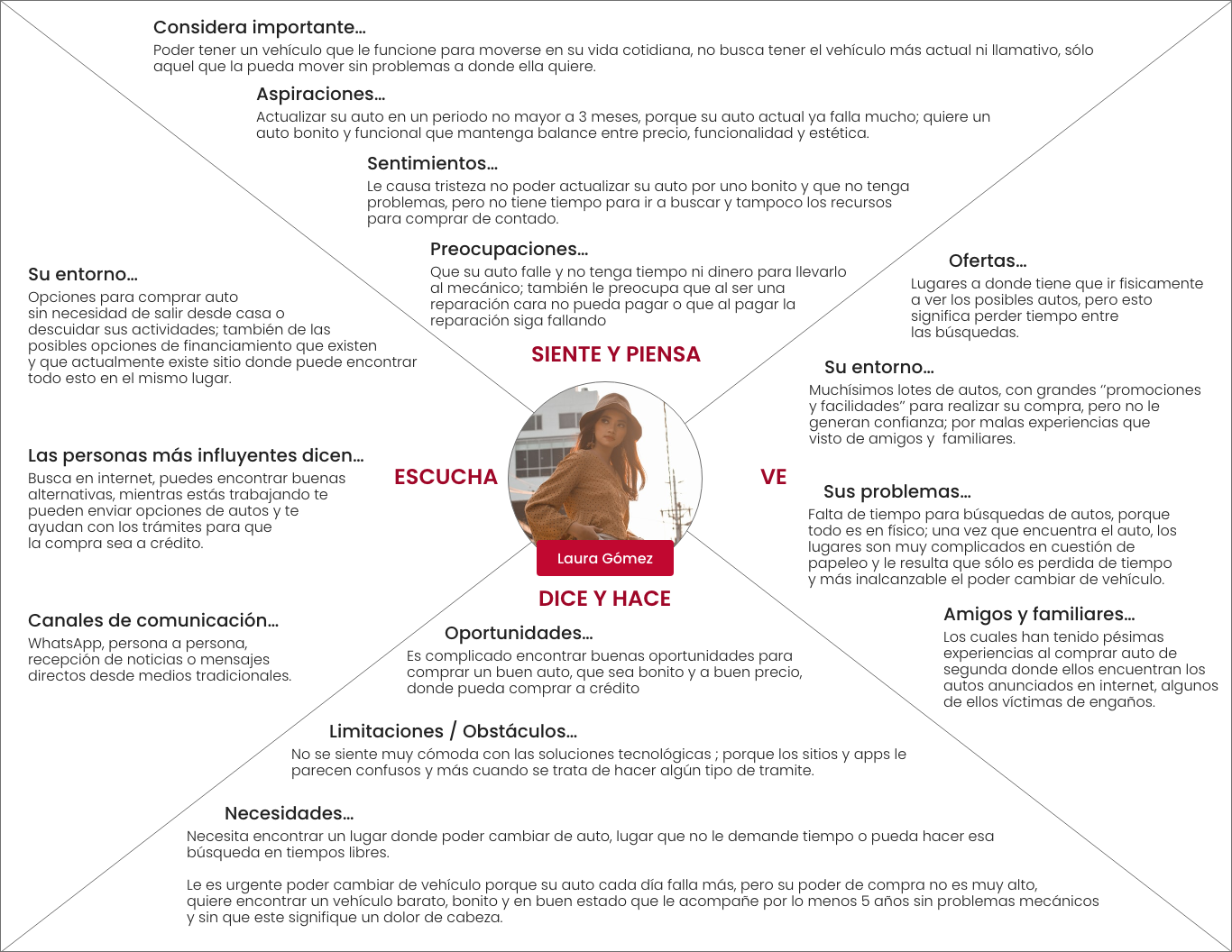
The project started with user persona mapping goals, anxieties, and decision triggers for the primary buyer profiles. Buying a car involves more than functional criteria. The emotional dimension (feeling informed, feeling confident, feeling respected) directly affects whether someone engages or leaves.
- Primary tension: users who research extensively online still needed emotional reassurance before committing
- Trust was the key conversion variable not catalog completeness or search functionalityTrust was the key conversion variable not catalog completeness or search functionality
- Mobile usage dominated discovery; desktop drove deeper research and comparison
- Peer testimonials and word-of-mouth had stronger influence than promotional content
Exploration
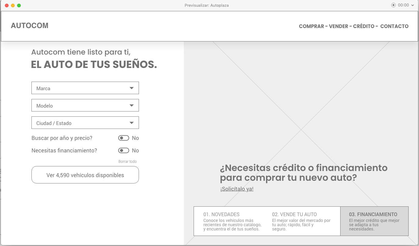
Wireframing started after the persona and journey work was locked. The exploration covered all stages and situations between user and system every interaction had a corresponding concept before moving to fidelity.
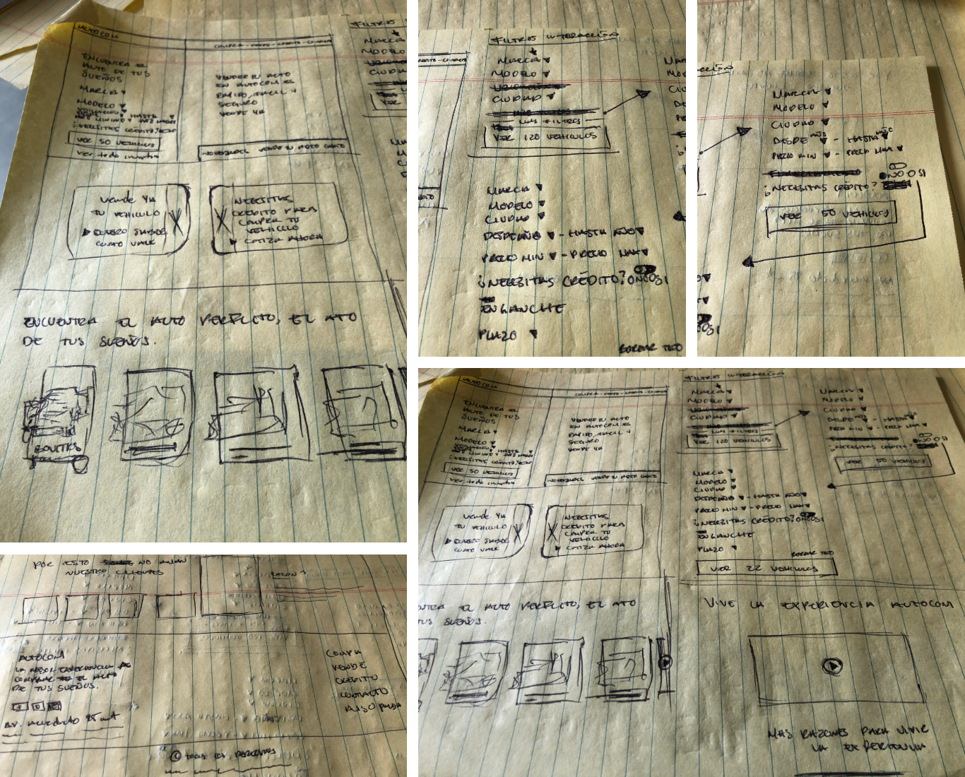

The welcome zone became a search-first entry point, reducing clicks to catalog entry and surfacing curated recommendations for users who weren't ready to search. Hot deals, new arrivals, and personalized suggestions gave buyers multiple valid starting points.
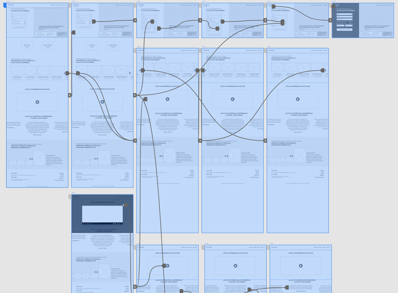
Wireflows & Validation
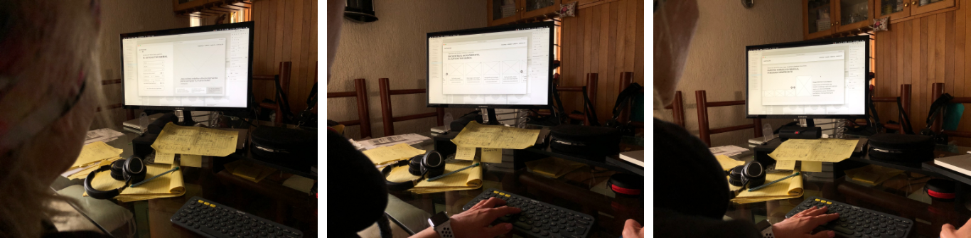
Wireflows validated correct user pathways for completing specific tasks. The question was simple: could users find a car, evaluate it, and feel ready to visit the dealership, all within the digital experience?
Design
The high-fidelity UI built on top of the validated UX foundation. Trust architecture drove the layout decisions: social proof at the consideration stage, process transparency for hesitant buyers, and a visual rhythm that created engagement without noise.
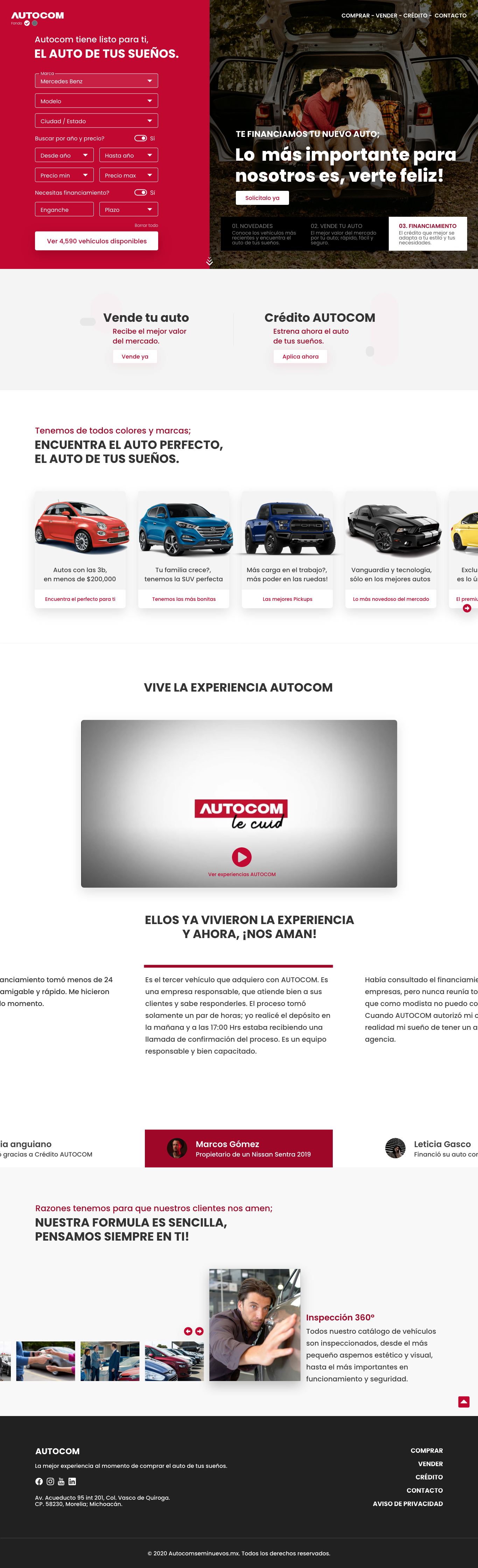
- Search-first welcome zone: reduces clicks to catalog entry
- Hot deals section with clear value framing for early engagement
- Customer testimonials positioned at the consideration stage, not just checkout
- Process transparency module: how Autocom works, building confidence in first-time buyers
- Varied section backgrounds to create rhythm and reduce scroll fatigue
- Responsive design across desktop, tablet, and mobile viewports
Outcome
Delivered a complete UX and UI product within a 28-hour design sprint. The solution addressed the full buying journey, functional discovery plus the emotional trust-building required for high-consideration purchases.
High-consideration purchases require designing for emotional states as much as functional tasks. A user who feels informed and confident is more likely to convert than one who simply found what they were looking for. Trust is a design problem.